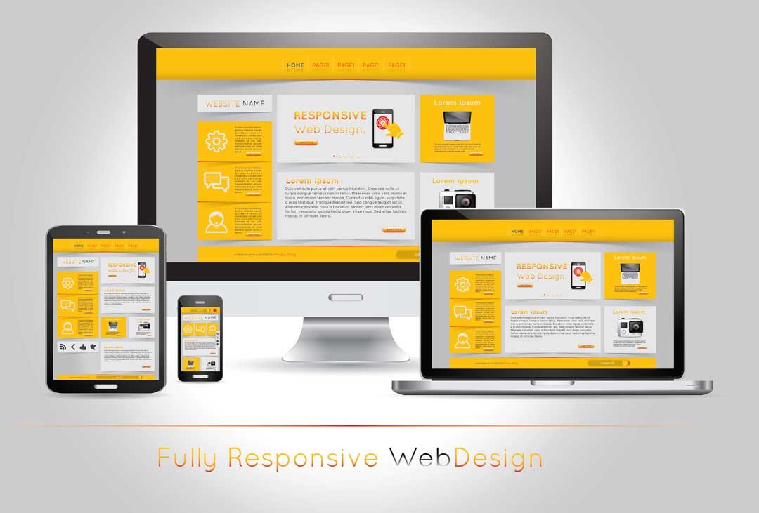
Responsive web design is becoming important with every passing day. The ever-changing technology and expansion of smartphones are pushing web designers to build a responsive website across various devices. The responsive website has set new standards for designers. Desktop first Responsive web design is an approach that lets you add all the features you want and create with high capacity. Nowadays where all the effort is invested in creating a mobile-first responsive website, desktop first is ignored. Designers have accepted the challenge and started working on desktop first design solutions to make their website stand out. In this article, we’ll look at the top tips for desktop first responsive web designing.
Advantages of Desktop first responsive web design
- You’ll get a view of all the major features right away
- It lets you visualize all the possibilities for your design
- It’s targeted at people using Desktop/Pc’s which is a great strategy
You must believe the modern website like Twitter is mobile friendly. However, you might not know that they have a lot of extra features provide desktop friendly experience. These websites are created with high UX. Therefore, you should create a website having rich features and strong desktop layout that can enhance the experience of desktop users. This is probably the biggest benefit of desktop first responsive web design. Though the term responsive website is largely associated with mobile friendliness, that doesn’t mean web friendliness should be ignored.
Desktop First Responsive Web Design Supporting All Browser
The critical part that comes when designing a desktop first design is supporting the browser. In fact, it’s sensible for mobile browsers to support desktop browser features. The only difference can be seen in touch-based support, rather than HTML and CSS. It’s important to consider the size of mobile and desktop and how different browser works on each medium. Furthermore, there are some rules to keep in mind while scaling down your design.
- Make tappable elements larger
- Increase body text size to make tapping easier
- Add JavaScript that supports swipe motions
Elegant degradation
This process helps build your website’s features with everything you want on the site and if the browser fails to support them you revert to the fallback method. A common example of this strategy is to remove the drop-down menus. On the contrary, your search for JS function for CSS3 that can’t be supported in the certain browser.
When desktop takes priority
Since there is growing trend of mobile-friendly sites, many of the developers suggest the need to build the desktop first website. The mobile experience of a certain site should be made, at the same time desktop experience needs to be dynamic and favorable. The desktop should be the priority and not be neglected when designing a great website.
Wrapping up
Responsive website Design Company makes it easier for users to have a dynamic experience. When designing a website, make it a priority to create a website mobile friendly and desktop friendly. Building a desktop first website is preferable in my case. Rest it’s your choice to choose whatever makes you feel right.
Author Bio
Lara Jason is a highly expert and renowned creative designer who has served a number of businesses in attaining them some of the most exclusive website designs for a better online appearance of their brands. She is currently working as the head of creative design team at a renowned web design company in Singapore and continues to contribute her views to several trending creative designing blogs.
You might also like:
7 Principles of Good Web Design and Development That Can Boost Your Brand
Best Web Hosting for Small Business: Cheap Hosting Features Comparison
Create interactive infographics: 10 Killer Tips to Create Eye Catchy Infographics
Fascinating Affiliate Marketing Email List Tactics That Can Help Your Business Grow
Importance of SSL Certificates in Online Business You Never Know!
Don’t Feed the Trolls: How to Keep a Healthy Comments Section
I’m a tech enthusiast, entrepreneur, digital marketer and professional blogger equipped with skills in Digital Marketing, SEO, SEM, SMM, and lead generation. My objective is to simplify technology for you through detailed guides and reviews. I discovered WordPress while setting up my first business site and instantly became enamored. When not crafting websites, making content, or helping clients enhance their online ventures, I usually take care of my health and spend time with family, and explore the world. Connect with me on Facebook, Twitter, Linkedin or read my complete biography.